Why Dynamic Y-axis Labels in Graphs are the Worst

Let’s talk about one pet peeve of mine in data visualizations: when your y-axis labels (the labels that go from top to bottom) automatically adjust themselves based on the data presented.

Now, in a few cases this is fine, but in most cases, you’re trying to visually compare the height of your chart content (let’s say bars in this case) from view to view, and if the y-axis labels dynamically update, the bar height becomes totally meaningless from view to view. I no longer have the ability to visually compare one bar against another.

A video is worth a thousand words, so here’s an example of trying to figure out if a 2-day trip to Vegas or a 3-day trip to Vegas is cheaper on Kayak.com:

Do not do this:

Thank goodness for the tooltip here, but it does force me to fall back to reading the number in the tooltip to make my comparison, totally eliminating the need for a data visualization here at all.

How to fix:

Calculate the upper bound on your data set across a reasonable number* of views and set the y-axis to be the same thing across these views.

*There’s some nuance here to keep your chart feeling snappy. Regarding “a reasonable number” of views: if >80% of people will click to another view of the chart n times or less, but your chart could have 200 views, or infinite views (e.g., looking at a time-based view and the user is clicking forward into the future), and you’re having to query the data live and covering more edge cases may negatively impact performance of that first chart loading quickly, then optimize your y-axis for the >80% use case (max over n views).

Thank you for coming to my TED Talk.

Hate Your Old Design Work and Love Yourself

Recently I was hit by the great tech layoff wave of 2023 and have been looking for my next adventure. As part of that, I’ve been working on a new portfolio.

This process reminded me of some advice I gave my former direct reports while I was head of design at Amperity:

You should feel good if you look at your old work and hate it.

A lot of designers told me they felt bad when they were looking at yesteryear’s projects. But my reply is, chin up, that is fantastic news. It’s a signal that the designer you are today has grown from the designer you were, and today-you can handily critique the work of yesterday-you. Regrets are just the lampposts to light our path forward, revel in them and celebrate that you’re now smarter than you used to be, more experienced than you used to be, and have more tools in your tool belt than the old you.

Instead of focusing on pain and embarrassment, celebrate the fact that you can now see mistakes or opportunities you once could not!

On the flip side, if you look at your work from a few years back and have no feedback for your former self, that might be a time to introspect a bit and ask if you’ve stopped deepening and widening your skillset.

The great news is, I have a lot of hate for my old work.

Meal Delivery Services Comparison

Someone on FreshChalk asked about meal delivery services, and I wrote up a long enough answer that I thought I’d re-post it here. For context, my partner and I both work a lot, and I’ve been struggling with a back injury. So about 3xs a week we use a meal delivery service. It’s cheaper and healthier than ordering delivery.

So here was the question:
> There are sooo many meal services out there (HelloFresh, HungryRoot, etc.) What are some that you have tried and liked or stuck with or didn’t like so much?

It really depends what you want.
If you truly want a no-cooking solution, avoid Hello Fresh or Blue Apron – they don’t send a meal, they send you a meal kit with ingredients and instructions, you still end up doing prepping and cooking. It was faster for me to cook simple meals on my own. One tip with these two – I sometimes had trouble with getting produce that was not very fresh, but if I wrote them about it, they would always credit me for whatever arrived sketchy.

For good no-cooking solutions, I’ve enjoyed Freshly for a long time but for the last 3 weeks have switched to Cook Unity.

FRESHLY
Here’s my Freshly referral link if you want to try them, you get $90 credit and I’d get $30: https://refer.freshly.com/s/Cassandra6500809
Pros: Freshly’s meals are tasty, and the easiest to prepare. Open the seal, pop them in the microwave for 3 minutes, then wait ~2 minutes. Dinner time! There are healthy, low-calorie/high protein choices.
Cons: The meals start to feel repetitive after a bit, like they are all coming from the same chef/restaurant. I hope you like cauliflower rice and zucchini noodles. They come in a box with a LOT of packaging. Frustrating if you’re trying to save the planet. Since the food is all cooked together, there’s not a lot of crisp veggies, it all ends up kind of soggy. If you don’t pro-actively pick your meals for a week by a certain deadline, you get a repeat of last week. OMG, that has happened to me SO MANY TIMES. Once three weeks in a row. Yes, I’m busy.

COOKUNITY
Then there’s CookUnity. I’ve been trying them for 3 weeks. I haven’t canceled Freshly yet, but I think I’m going to stick with them.
Here’s my referral link, you’d get $50 off, and so would I: https://www.cookunity.com/landing-referral?referral_code=cassawal77
Pros: CookUnity’s meals are tastier, and feel more like you’ve ordered from a restaurant – the options are more diverse and can include things like salad or other crisp veggies. The meat feels like a higher quality too. Servings are super generous, but there are <600 calorie choices too. You can see ratings on meals from other users when choosing, you can schedule your choices weeks out ahead or have them auto-select for you based on preferences, and meals show what chef they are from, so you might find if you like a certain dish, you can try meals from the same chef. The best part: at least where I am, they drop off in a collapsible fabric cooler with reusable ice packs, and the next week they pick it back up again! No crazy packaging, and no filling my recycling with boxes and my garbage with packaging every week! YAY EARTH!
Cons: since the meals have more variety, the instructions for prep do as well: so for example, instead of every.single.meal being “microwave for 3 minutes” sometimes it’s “take the meat out, pour the sauce over it and microwave, then put it over the salad.” it’s always pretty simple though, maybe taking 60 extra seconds over Freshly, and the result (non-mushy veggies) is very worth it. Lastly, their name is weird, I can never remember it.

Notes for both of these:
You can put them on pause when needed, so you could try both and enjoy some discounts, then keep whichever you prefer. I find them filling (5’4″ woman) but my partner (6’1″ man) usually had to add a side – so far, we’ve found CookUnity has larger portions. Both include calorie and protein information, and offer some veggie choices.

Good luck, and feel free to ask me any questions!

Pie Charts are the Worst

Recently I’ve been leading the product design team at Amperity in a deep-dive into data visualizations: which ones to use for different use cases, and how to simplify them to highlight a narrative. We’re going through a great book I’d recommend by data viz expert Cole Knaflic called “Storytelling with Data”. Years back I took her data visualization workshop and loved it, and if there’s one thing I wholeheartedly endorse about this guide it’s that it completely hates on pie charts.

I get asked frequently about my burning hatred for the infamous pie chart, so I decided once and for all to document this rant.

Yes, this is my background on Zoom calls.

Why Pie Charts are the Worst:

  • Pie charts are hard to understand. Human beings are not good at spatial estimation of the areas of two or more differently-shaped objects tilted at different angles for comparison to each other.
  • If you have more than five slices, values become even harder to compare against each other.
  • If you simply rotate the pie, a person will value the cuts of the pie differently even though you haven’t changed the weight of each slice (there’s a wonderful illustration of this by Stephen Few).
  • Worse, if you make it a 3D pie chart, you can manipulate people into believing the “closer” slices are larger than the further slices due to tricks of perspective.
  • They take a lot of space to convey their message (albeit poorly).
  • Pie charts imply 100% of a whole is represented, but that’s not always true. 
  • Almost any use case you have for a pie chart, another chart can be used to more accurately convey information.

Alternatives to Pie Charts

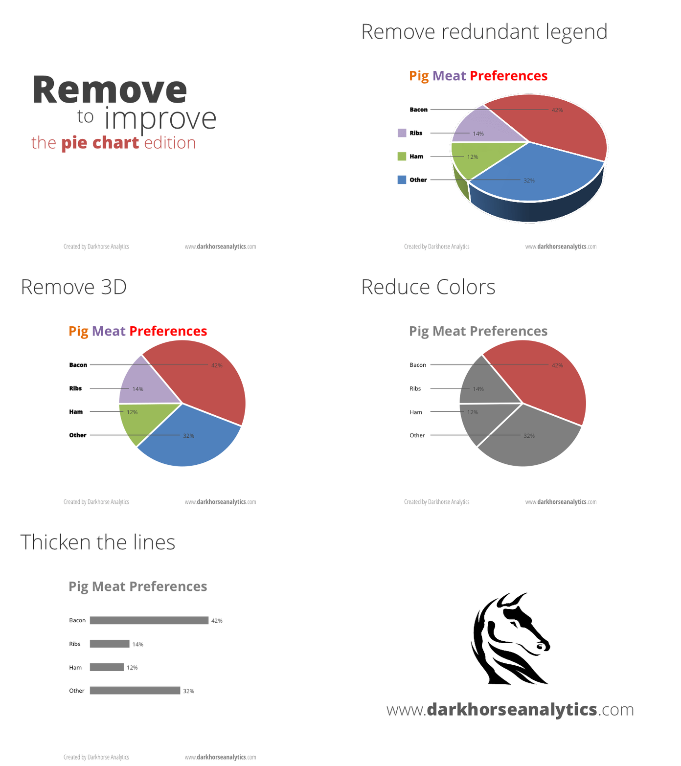
If you must use a pie chart, this handy gif shows my recommendations for how to fix it:

Credit: Joey Cherdarchuk

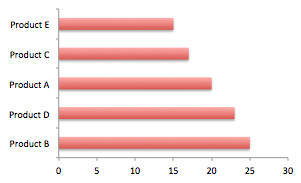
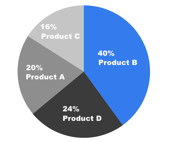
Seriously, if you want to use a pie chart, at least try this exercise first: make it a horizontal bar chart and ask yourself which is easier to quickly read. I loved this quintessential example from Bernard Marr:

Which one tells you at a glance that Product D sold more than Product C, and that Product A is in 3rd place?

When to Use a Pie Chart

The truth is, pie charts can be used for good and not evil, given some very, very specific set of scenarios. ALL of these must be true:

  • You are comparing a small number of categories (ideally 2-4),
  • The categories are all mutually exclusive,
  • The categories all add up to 100% of the whole of something, and it’s important to convey that fact, in fact it’s more important than people really understanding the difference between the sizes of each slice of pie, and
  • It’s not that important that people can compare the slices to each other with a good level of accuracy (e.g., one piece is way bigger than the rest combined and that general point is the only thing that you’re trying to get across to viewers).

If you find yourself here, for all that’s good and holy, at least try to follow these guidelines:

  • Order your pie pieces from largest to smallest, with the start of the pie at the very top.
  • Clearly label your slices (I prefer directly labeling with what it is and its percentage, to reduce the cognitive load of having to color-match to a legend. Oh, you don’t have space for that? Maybe don’t use a $%^& pie chart.)
  • If you use 3D, a pox upon your children and your children’s children.
  • Don’t say I didn’t warn you.
I fixed it, and I still don’t like it.

The above is an example using these principles: a “good” pie chart. And it’s still pretty not great, a huge waste of pixels, and easily replaceable by a bar chart.

As an aside, donut charts are just pie charts that are even harder to read. They have less room for proper slice labeling, and now instead of asking a mere human to guestimate the area of a vaguely triangular-shaped thing, you’re asking them to guestimate the area of an arch-shaped thing, and then do that with other arch-shaped things to somehow accurately compare them. Even worse. Just… don’t do this.

When to Use a 3D Donut Chart

The Last 2020 Push: a Half Marathon

2020 has been a crazy year in so many ways, both good and bad. More on that later (maybe).

One thing I’ve done to keep me occupied and sane during COVID-19 lockdown has been to exercise. Last week, my sister and I decided to commit to running a half marathon in December. This gives me just enough time to train, assuming the smoke stays away from Seattle.

It’s a virtual run so I get to plan my own route. This is what I’m working toward:

This is my first half marathon. I have trained for one in the past but sprained my ankle right before race day, so I am determined to do this.

Weighing Defaults vs Discoverability

An anecdote:

Having lost sound in one ear of my earbuds, I dived into my stash of electronic odds-and-ends and snatched a new pair of cheap wired earbuds. I had, of course, Zoom meetings to attend.

A while back, I started picking up cheap earbuds here and there ad-hoc, having only one purchasing criteria: they must have an integrated mic for meetings and calls. So like any pair I’d owned since, they had a small bulge on the cord for the mic.

Like a normal user, I didn’t read the packaging beyond a quick scan for my one top-of-mind criteria: microphone.

Fast forward, after a day of using this new set, I was ready to toss them in the garbage. Why? I had trouble hearing my colleagues very well – they sounded so unusually quiet. Turns out I had more than one criterion, an even more basic one: hearing. I fiddled with my normal troubleshooting steps I’d had for previous similar earbud sets: make sure it’s plugged in firmly, the volume was up on my MacBook, and the volume was up in my application.

It wasn’t until day two… and sort of by accident… that I noticed this set had a volume slider on the cord where I assumed only the mic lived. Only laziness had kept me from tossing this brand new set before that revelation.

The Moral of the Story

This may sound like a typical case of PEBCAK – problem exists between chair and keyboard – and yeah, checking the device for extra controls along with my troubleshooting steps would have solved this, but the point is, I had an “extra” feature I didn’t expect that caused more damage than good because as a user I did not factor it into how I was supposed to interact with the device.

The device’s problem was not that it was too extra (the sound volume slider is pretty neat!), it was that I had no clue about this factor and it was impacting my experience getting my base criteria met.

Takeaways

  • Defaults should be set carefully and intentionally and weighed against discoverability. If you can achieve both, by all means, do that – but do not force a user to adjust defaults just to ensure they run through their options – default for the 80% use case scenario or risk user frustration.
  • If your new setting/option/feature does not need to impact the user, it should not. How important is it for me to know I can adjust volume versus avoid thinking my device is broken?
  • Think about how a change could negatively impact a current user, or a first-time-user experience. If the device default volume had been set at 100%, the problem would be averted.
  • Most users will take minimal (if any) troubleshooting steps, and if they are taking troubleshooting steps it is under the context of things they know, and may leave out pieces yet undiscovered. If they are troubleshooting, it is safe to assume they are also already frustrated.
  • A feature that is “standard” for you may be new to your user. Anything outside of very MVP maybe be something extra they haven’t seen before. Be sensitive to that to make it a win instead of a point of confusion.

The Design-Driven Startup: UX as Preventive Care instead of a Band-AID

I was honored to be asked to be a keynote speaker for the XD Leadership Alliance, a group I’d highly recommend to leaders in Product and Design. Thanks to the XD Leadership Alliance’s great team, here is the summery and full recording of the 50-minute talk I gave at the Columbia Tower Club on May 30, 2019:

In a world where design is often an afterthought, what does starting a startup with a user-centered design from day one look like? How do you make design a part of your company values? Together, we’ll contrast the process of adding design in later versus starting out with a designer-founder at the helm, approaches that drive startup design ROI, tactics for achieving design emphasis with tight startup resources, and pitfalls to watch out for. In addition, we’ll touch on ways to permeate company culture with design principles, whether your company was started with a design-focus or you find yourself adding it in years later.

It looks like you’re trying to visit Seattle…

Here’s one local’s perspective on how to do Seattle without doing the clichĂ© tourist trip(e). I will update this as I think of more to add.

It looks like you’re trying to visit Seattle…
  • HOT: Coming in mid-July through mid-September. Nowhere is better this time of year.
  • NOT: Coming in June and packing shorts. HA! Welcome to what we like to call “June-uary” here in Seattle.
  • HOT: King County’s “Water Taxi” pedestrian commuter ferry to West Seattle’s Alki beaches ($3 via your Orca card).
  • NOT: Over-crowded, less-frequent, much more-expensive ($30+) and going-nowhere Argosy cruises in the Puget Sound (aka, on the same waters). The one pro here is these are longer (1 hour +) so if that’s what you want: here’s the link.
  • HOT: Hitting up the Sky View Observatory ($20), a 902-foot panoramic view on the 73rd floor of the Columbia Center. Or, for zero dollars, go to the 40th floor for the highest Starbucks west of the Mississippi and get about 4/7ths of the experience, and maybe a latte while you’re there.
  • NOT: Paying $30+ to go up to the top of the Space Needle (a measly 605-feet tall structure).
  • HOT: Using Intentionalist to find delicious and unique new food experiences and other small businesses in Seattle – you can even specifically support businesses owned by veterans, LGBTQ people, minorities, and other groups you’d like to support.
  • NOT: Using Google or Yelp to go to the same boring chains you could find anywhere else.

Becoming a Humble Designer in 3 Easy Steps

The single greatest enemy we have as product designers is our own ego, our own hubris. We walk into a situation with this idea that we know what is going on. Throw that right out the window. Users will constantly surprise you if you listen, and along the way they will make you a better product designer.

Here are just a few guidelines I’ve developed while striving to be a more humble designer, especially in usability interviews:

1. We must check our assumptions at the door.

It is essential that questions are posed in as close to an unbiased, non-leading manner as possible. If we already think we have the answer, we will unconsciously work backward from that and look for that pattern in the data, ask the leading questions, or skip the questions that really needed asking.

Do this:

  • Humble approach: “Tell me about your experience with X…”

Not this:

  • Ego approach: “Has your experience with X been frustrating?”

2. We must shut up and listen.

We are there to learn, not to teach. Let the user do most of the talking in a user interview. If there is an awkward pause, revel in it. If you ask a question and get a reply, don’t assume they are done… once you think they might be done, start counting up to seven, wait for it, let it simmer… and you might find in that extra moment they have a chance to fill the silence with a gem they had been struggling to articulate.

Ask open-ended questions, practice active listening, and let them ramble as much as possible – in fact, ask follow up questions about little aside comments to “pull the thread” on layers of conversation. You may find a goldmine of information if you are willing to dig a bit.

Try this:

  • Curious approach: “This is helpful. Can you tell me more?”

Not this:

  • Defensive approach: “I hear your feedback, but the reason we designed it this way is because… yadda, yadda, yadda…

3. We must truly beg for harsh critique.

People want to be nice, bless them. People are generally kind. They want to tell you what they think you want to hear. But it makes good design work impossible without a very proactive and self-aware approach. This inherent desire of people to tell you the “right” answer is why it is 100% essential to write questions in an un-biased manner.

It’s also helpful to give them explicit, repeated permission to be harsh – letting them know that you see the product day in and day out and need their fresh set of eyes. And when they do give that feedback, do not get defensive or try to explain away why the interaction was hard for them. Smile, nod, document the heck out of it, and then go make it better. They just did you a huge favor by opening up and sharing. Do not burn that bridge. Thank them.

Example (my actual email to a user):

I really appreciate you for sharing this learning with me! It’s easy to know what to click when you have designed the interface, so having others’ eyes on the system helps to reveal to me things I could not have seen without the help of yourself and other users like you who are willing to share. Thank you. 🙂

When you craft questions, do so in a manner that gives them inherent permission to be honest instead of nice.

Try this:

  • Humble approach: “If you had to make three changes, what would you want to improve?”

Not this:

  • Ego approach: “Is there anything you’d change about the workflow?”

90% of the time most people will shrug and say, “No, it’s fine.” to the second question, but the same people will almost always have an answer to the first.


This list is far from exhaustive but it will get you thinking in the right mindset. The most important aspect is to be mindful of your own ego in these interactions.